Bus Punctuality Analysis & Prediction

I – Background Information

To ensure the efficiency of their service and identify areas of improvement, a public transport operator was interested in analyzing the punctuality of their buses and building a streamlined Business Intelligence reporting system.

The client needed a simple and intuitive tool to gain insights into the quality of their operations with regards to their scheduling. Equally, they wished to monitor the services provided by third party operators. Due to the thousands of vehicles dispatched daily, and the volume of data subsequently generated, the previous approach proved to be tedious and overwhelming.


Additionally, in a bid to anticipate network issues and improve scheduling, the transport operator wished to identify the root causes of non-punctual buses. Forecasting delays for example may allow the client more flexibility and precision when designing bus timetables, ultimately improving customer satisfaction.


The goal of this project was therefore:


      • Build operational dashboards for bus punctuality.
      • Assess the quality of data collection process.
      • Define a data modeling roadmap and lay foundations for automated punctuality predictions.

II – Approach

The first task was to collect the client’s internal data from various sources, clean them, and transform them into intelligible formats. We used feature engineering techniques to extract information regarding previous journeys for a given bus and to extract the status of the journey, whether it was on schedule or not. As we needed to assess the quality of the clocking system used in the buses, we also created a new parameter to flag any detected deviations or problems within the collected data.


Once the pre-processing work done, we centralized the data in a new database and created a new data model with the integration of external data such as geographical data and weather data.


Project Architecture.
Bus Punctuality – Project Architecture.

Through multiple discussions with the business stakeholders, we defined the needs, requirements and priorities to create operational reports and dashboards. We built multiple reports to track various KPI’s related to the punctuality of the buses. Most notably we built intuitive dashboards for tracking the punctuality of buses for departure and arrival, designing geographical maps for tracking the punctuality in different municipalities and regions, and to view the punctuality of third-party operators.


In parallel to the creation of operational reports, we performed the predictive analysis steps. The objective was to model the data and to predict if a given journey was likely to arrive late. We started by analyzing late journeys to identify trends with parameters such as the weather, the region, the bus route and the bus number. We used a wide-ranging list of tools such as descriptive statistics, inferential statistics and data visualization for this step. Next, we set up two prediction tasks:


      • a classification task.
      • a regression task.

For the classification task, we created three classes:

      • Ahead of schedule.
      • On schedule.
      • Late.

For the regression task, the objective was simply to predict the time of arrival. For both tasks, we created predictive models using multiple machine learning algorithms and selected the best performing ones.  A forward stepwise feature selection process was implemented to select the variables with the highest predictive impact on the models, this helps both in terms of running time and the interpretation of the algorithm. Given time restraints we setup a roadmap to improve, optimize and deploy the predictive models in an operational setting, and, as the quality of predictive models depends on the quality of the data, we provided recommendations to further enhance the data collection process.

III – Results

The new operational reports provide a centered, intuitive and simple reporting solution to visualize the punctuality for the client’s fleet of buses. This solution enables the transport operator to gain valuable insight in their continuous operations and act efficiently based on the reported information.


Additionally, with the help of the quality analysis on historical data, and the continuous quality assessment provided by Valkuren, the client can take the correct measures related to the collection process and continually monitor this process to detect any future problems.


As a result of the foundations established for predicting future bus punctuality, the defined roadmap to automate the predictive models and the transfer knowledge provided by Valkuren, the client has all the tools necessary to deploy the process to a production environment and integrate it in the decision-making process.


Lastly, there are many opportunities to scale the solution to further regional directorates within the company to increase consistency and uniformity across the board.

Predictive Maintenance for Public Transport Assets

I – Background Information 

The ever-increasing population in cities across the world increases the pressure and expectation of the availability and punctuality of public transport services. Thus, consequences associated with unexpected incidents, involving transport assets, include high repair costs and major disruptions to the entire transport network, ultimately having a detrimental effect on the business. The identification and implementation of an appropriate maintenance strategy can help in the optimization of maintenance planning and scheduling, decrease rolling stock downtime, and increase the life expectancy of assets such as trams.  


The main maintenance strategies today rely mostly on preventive maintenance as well as on condition maintenance, however, although still relevant, preventive maintenance typically results in over maintaining assets and high cost. It is subsequently of high interest to increase the use of advanced maintenance strategies and reduce reactive maintenance events. Thus, allowing more time to respond which in turn enables greater flexibility to dynamically plan an appropriate maintenance strategy and decrease cost. 

The goal of this project was to provide precise and reliable predictions to optimize planning and downtime maintenance of trams using data from a wheel measurement device

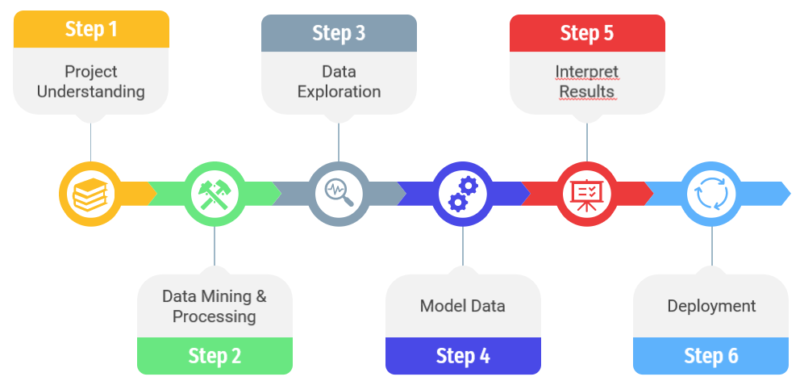
II – Data Pre-processing 

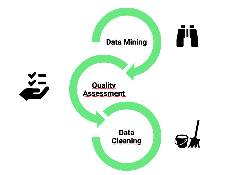
The first task in any data science project consists of transforming raw data into a more understandable formatTo better understand the state of the data, and to determine the information that is usable, a quality assessment is first conducted.  

The quality assessment enables us to identify missing values/measurements, corrupted values, incoherent values, and duplicate values.  

This quality assessment is followed by a data cleaning process to remove the flawed measurements/values. In this project, we removed over 50% of the data at hand due to missing and incoherent values. Furthermore, duplicates were removed along with outliers. For the removal of outliers, we used the Z-score metric, where we calculate the Z-score for every single target value (the measurement we want to predict) and remove the values for which the z-score is above a certain threshold.  

The Z-score, also known as the standard score, measures the number of standard deviations an element is from the population meanThe Z-score is negative if a given element is below the mean, and positive if it is above the mean. Logically the closer the Z-score to zero, the closer a given element is to the mean of the population. In this project, the Z-score is calculated to determine which measurements for a unique tram wheel are outliers and need to be rejected from the data set. Subsamples for each unique tram wheel are created to calculate the Z-score for the given measurements and a carefully fixed threshold allows us to reject any observation that differs greatly from the population mean. 

Lastly, part of the of the preprocessing task is to integrate metadata, from different sources, that may help us understand the behavior of the data we initially have. When integrating data from multiple sources it Is of high importance to define a schema, which all data must respect, in order to maintain consistency and compatibility. 

III – Data Exploration/Analysis 

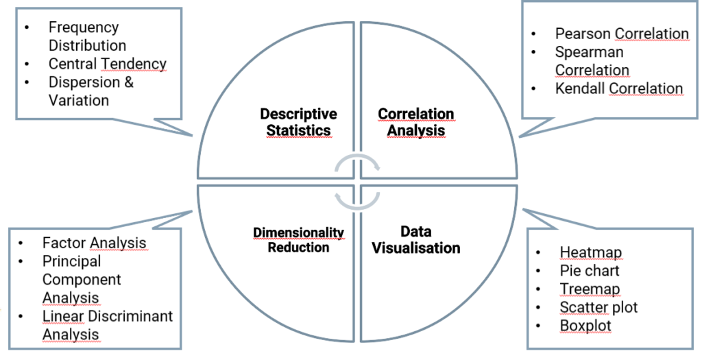
Once the preprocessing step is complete, the next step is to explore the data using visualization tools, and summarizing functions.  

For example, we could visualize the trends in wheel measurements over time along with various weather measurements.  

In addition, we calculated summary statistics such as the median, average, standard deviation of the variables in the data set, as well as the average wheel deterioration pre-covid19 lockdown restrictions and during covid19 lockdown restrictions imposed throughout EuropeKnowing some trams serviced at the same rate during the lockdown compared to pre-lockdown, we took advantage of this unprecedented period to investigate the effect the passenger load has on the deterioration of the wheels. 

Another step to better understand the data, is to understand the relationship between the variables we possess. Specifically, the relationship between the target variable and the remaining variables in the dataset. There exists several different correlation statistics, such as the Pearson correlation, the Kendall correlation, Spearman correlations, each having their own perks. In this project, we decided to use the Pearson correlation, as we look to measure the relationship between the wheel measurement variable and subsequent linearly related variables.  

As a side note, the Pearson correlation coefficient yields values between -1 and 1, meaning the closer the coefficient is to -/+1 the higher the degree of association between the two variables. On the other hand, a coefficient equal to 0 indicates no relationship between the two variables. 

Furthermore, correlation coefficients enable us to reduce the number of input variables, by selecting the variables with the strongest relationship with the target variable and are believed to be most useful when developing a predictive model. As we reduce the number of variables used to predict the target variable, we also reduce the computational cost of the model. 

IV – Model Build : 

Train test split: 

Since we are dealing with time series data, any random sampling approach, to select instances from the population to compute the expected performance, should be avoided. These approaches assume that the instances, in this case the measurements, are independent. However, the wheel measurements at a time t are highly dependent on the previous measurements at time t − 1. Applying a random sampling approach to evaluate our model would overestimate the performance of the model and lead us to a false confidence state. This problem is solved by creating subsets of the data to generate training and validation sets. The training set therefore contains 80% of data, according to the timestamp of the measurements, and the validation set contains the remaining 20%. 

Evaluation method: 

In such a practical application as this project, it is fundamental that the results are accurately evaluated. As the goal is to forecast the wear and tear of rolling stock assets, which ultimately leads to maintenance planning, the performance of the predictions must be measured in an effective manner. This is paramount in avoiding maintenance shortfall or unnecessary maintenance, which could in turn lead to higher costs. Furthermore, it is paramount to determine a suitable evaluation metric for the given problem. As we are dealing with a regression task, we want to measure the differences between the predicted values and the observed values. For this purpose, &. The RMSE corresponds to the quadratic mean of the differences between the observed values and the predicted values.  

V- Results : 


Ablation study: 


To understand the behavior of the predictive model, and the importance of certain features, an ablation study was conducted. An ablation study consists of removing a feature from the model to access the effect it has on the performance. By removing certain features one by one, we’re able to understand the importance they have in the construction of the predictive model, and to identify which features could ultimately be left out.  


SHAP values: 


Another way of discovering which features are the most important for the predictive model is to calculate the SHAP values. SHAP, Shapley Additive Explanations, is a method proposed by S.M.Lundberg and Su-In Lee for interpreting the predictions of complex models. This method attributes the change in the expected prediction to each feature when conditioning on the latter.  

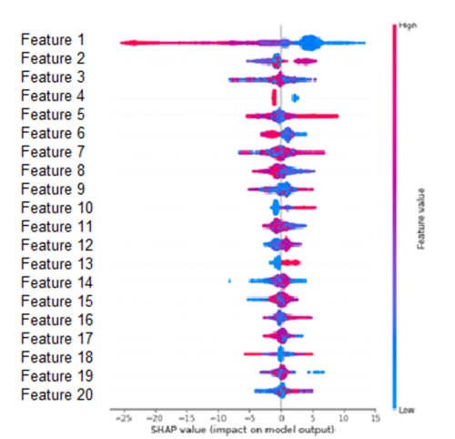
The Figure below orders the features according to the sum of the SHAP value over all samples in the training set. This Figure shows the impact that the features have on the model output depending on the feature value. For example, a high value of ‘Feature 1’ lowers the predicted value. On the other hand, a high value of ‘Feature 13’ increases the predicted value.  

VI  Conclusion : 

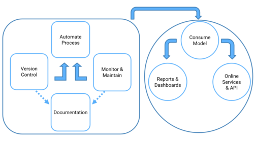
The main benefits of predictive maintenance improve the overall day to day operations, especially in a fast-paced environment such as public transport. In the current context, the fruition of this project would enable the maintenance teams to integrate planning into a single platform. On one hand allowing them to visualize and interpret real time data, on a day to day operational actions, and on the other hand providing them with maintenance decision making based on state-of-the-art asset predictions. The development of such a platform yields the possibility for maintenance teams to visualize the predicted and forecasted deterioration and failures of assets and, suggest to users the correct course of action to take. 

More generally and in a larger context, as cities across the world rely deeply on public transport, reliability is at the forefront of transportation strategies. It is therefore of upmost importance that asset management is optimized through predictive maintenance. Through future predictions, transportation services can ensure maintenance is performed only when required before imminent failure, thus reducing unnecessary downtime of assets and costs associated with over-maintaining equipmentPreventing such failures limits the severity of damages to the assets and improves the life expectancy of equipment. This ability in turn provides optimal planning and storing for spare parts, rather than having an overabundance of stock. Lastly, predictive maintenance offers the opportunity to greatly reduce the number of incidents on the transport network, which in turn improves the all-important passenger safety and comfort. 


​Written by Magnus Kinder, Data Scientist @ Valkuren 

Working with data – Valkuren’s way

The first step of working with data is data acquisition. At an early stage we realised that data extraction from the whole range of sources our clients use, would be a key component of our everyday work. As companies grow, their data grows as well. It grows in volume, density (volume/time) and complexity. So, what might first seem as an easy-to-do, manual operation soon turns into a major, hard-to-handle big data process.  


That is why, Valkuren came up with its solution. The data would be extracted and tabulated automatically by a workflow mechanism, Apache Airflow, on Amazon Web Services. This workflow would be a composition of DAGs (Directed Acyclic Graphs) we could switch on and off as needed. A DAG is a collection of all the tasks you want to run, organized in a way that reflects their relationships and dependencies. Each DAG would represent one of the sources of data, for example, if a company extends its marketing campaign in social media such as Facebook and Instagram, there would be a DAG for Facebook and a separate one for Instagram; if the company sells using an online platform such as WooCommerce, a graph representing it would be introduced. Each DAG would be made up of the variety of processes in the data workflow. If we consider the example of Facebook, the graph would start with the data extraction (respectively for posts; page insights; etc.) from the social medium’s API, afterwards the data would be transformed to adapt to our visualization and analysis needs and finally it would be saved in tabulated form as required.  


Each graph has 2 variants of running, either a one-time run or an incremental run. The one-time run DAGs were only used at the start of our automated work, whereas as the incremental DAGs run once a week so as to extract, transform and save the observations of the week and therefore incrementing our data volume


However the automation of the workflow is not and will not be our only challenge in this developing field, that is why we are always changing, growing and improving, with the single purpose of unlocking the power of data

Writing by Uendi Kodheli data scientist @Valkuren

The recommender system in e-commerce


A recommender system is a filtering process which consists of suggesting relevant information to users. Rather than showing all possible information to a user at once. In the case of an online store, the purpose of a recommender system is to offer the customer, products or services, adapted to his profile. This process filters the information to a subset based on methods such as Collaborative filtering, Neighbour-based Collaborative filtering, and Content-based filtering. 


Collaborative filtering methods for recommender systems are methods that are solely based on past interactions recorded between users and items to yield new recommendations. The main idea is that past user-item interactions are sufficient to detect similar users and similar items to make predictions based on the estimated proximities. The main advantage of collaborative approaches is that they require no information about users or items and, so, they can be used in many situations. 


Content-based methods, on the other hand, use additional information about users and items. These methods try to construct a model based on the available features on the items, that justify the observed user-items interactions.


Several factors have influenced the use of recommender systems. The growth in digitalization, the increasing use of online platforms, and the abundance of online information has accentuated the importance for businesses and organizations to offer the right information, whether that be a product, a service or content, to the right user at the right time. Recommender systems meet this need, and have many benefits such as improve customer experience, not exclusively through relevant information, they additionally offer the correct advice and direction. Thus, engage and increase user interaction, and create the ability of tailoring and personalizing offers to users, which could ultimately lead to increase revenue depending on the business. 


At Valkuren, we implemented this recommender system for an e-commerce platform to optimize the consumer experience on our client’s website. We used the predictive method to improve the product offering to consumers based on their search using purchase history and estimated proximity.


Feel free to contact us for more detail!


Welcome Back !

We are very pleased to announce that the Valkuren team is growing. Magnus, our former intern & job student in Data Science, is back with us. We let him introduce himself.


We are very pleased to announce that the Valkuren team is growing. Magnus, our former intern & job student in Data Science, is back with us. We let him introduce himself.


Having recently graduated from a Master’s Degree in Data Science for Decision Making at Maastricht University, I am extremely excited to join the young team at Valkuren as a Junior Data Scientist. Passionate about data-driven decision making and problem solving. I started my higher education studies at Bordeaux University in Mathematics and Computer Science. This gave me the fundamental learnings to further pursue my studies in Data Science, and the motivation to face new challenge in a completely new environment in Maastricht.


During my Master studies I did an internship at Valkuren with a project at the STIB-MIVB on a predictive maintenance project. I helped the Data & Analytics team to design a functional pipeline to predict future wear and tear of tram wheels.


Once my internship came to an end I continued working part-time for Valkuren alongside my Master thesis, and designed the methodology for future data science projects.

I now join Valkuren full-time. The opportunity to jump start my career, continue learning and grow simultaneously with the company was extremely appealing.


What do you enjoy doing in your spare time?


At the end of the day I enjoy to wind down with a book, currently I’m reading Mick Herron’s spy thriller series ‘Slough House’.

Currently I’m spending my evenings finishing up an article on my thesis research for publication. My work proposes a new methodology for the classification of single-cells using a new feature selection algorithm.

Other than that, I enjoy traveling and spending my time outdoors with friends.

How to carry out a data science project? (Part 2)


Step 4: Model Data

We could separate this “model data” step in 4 different steps: 


      1. The feature engineering is probably the most important step in the model creating process. The first thing to define is the term feature: are called feature the raw data as received by the learning model. The feature engineering is therefore, all the actions carried out on the raw data (clearing them, deleting null data, deleting aberrant data) before these data are taken into account by the algorithm, and thus the model. In summary, feature engineering is the extraction of raw data features that can be used to improve the performance of the machine learning algorithm
      2. The model training is the action of feeding the algorithms with datasets to start learning and improving them. The ability of machine learning models to handle large volumes of data can help manufacturers identify anomalies and test correlations while searching the entire data stream for models to develop candidate models.
      3. The model evaluation consists of assessing the created model through the output given by the model after having process data through the algorithm. The aim is to assess and validate the results given by the model. The model could be seen has a black box; you have the input that are given to the model algorithm (the dataset) in the model training and the output that are asses during the model evaluation. After having assess the results, you could optimize your model in the previous step.
      4. The model selection is the selection of the most performing and adapted model from the set of candidate model. This selection depends on the accuracy of the results given by the model. 

Step 5: Interpret results  

The main point about interpreting results is to represent and communicating results in a simple way. Indeed, after having process the previous step results could be heavy and hard to understand.

In order to make a good interpretation of your results, you have to go back to the first step of the data science life cycle that we have cover in our last article, to see if your results are related to the original purpose of the project and if they are any interest in addressing the basic problem. Another main point is to see if your results have sense. If they are and if you answer pertinently to the initial problematic, then you likely have come to a productive conclusion.  

Step 6 : Deployment

The deployment phase is the final phase of the project life cycle of a data science project. It consists in deploying the chosen model and applying new data to it. In other words, putting its predictions available to user or service system is known as deployment

Although the purpose of the model is to increase understanding of the data, the knowledge gained will need to be organized and presented in a way that the client can use and understand it. Depending on the needs, the deployment phase may be as simple as producing a report or as complex as implementing a reproducible scientific data process. 

By following these steps in your data science project process, you make better decisions for your business or government agency because your choices are backed by data that has been robustly collected and analysed. With practice, your data analysis gets faster and more accurate – meaning you make better, more informed decisions to run your organization most effectively. 


© Valkuren

Valkuren team

Today we are going to let our team member present themselves to you!


Hey, I’m Brieuc, Sales & Business developper. At Valkuren, I can be accomplished in my work by combining my several  points of interest in everyday business:  Marketing, strategy, management and data.


“In Tech we work, in Human Link we trust”, I’m Valérie, the managing partner of Valkuren, Everyday I’m happy to work, share knowledge, drive the team @ Valkuren and bring expertise to the customers in their Data Analytics Strategy. As a founder I promote gender equality & diversity. I’m really proud of the Valkuren Team and the work we do & deliver. 


Hello, I am Lienchi. I am a Data/BI analyst at Valkuren. I use powerful tools to guide businesses to change, improve their processes and optimize their data. It allows me to be creative and it is a really rewarding journey.


Hi! I’m Mathilde and I am an intern in HR consultant at Valkuren. My motto: a happy worker is a productive worker! So, I am working on modifying/creating processes, that comply with Belgian laws in order to improve the employee’s wellbeing in the company. 


Hello everyone, I am Arthur and I am currently working as a Data Scientist at Valkuren.  I am always enthusiastic to embark on a new data-driven journey, looking for some nice insights for your business!  


Hey I’m Uendi, Data Scientist at Valkuren. As a mathematics graduate, I’m happy to admit that science is my passion and talent. I often find myself exploring its applications in my life. At Valkuren, this passion of mine was re-established and I was reassured about my path in the shoes of a woman in science and technology. “Valkuren is the key to my personal and professional growth, the only way to do great work is to love what you do.”  


Hello, I’m Magnus,Présentation Magnus Kinder Data Scientist at Valkuren. I thoroughly enjoy problem solving and have a passion for data-driven decision making, keeping up to date with the latest tools and techniques. I have particular interests in methods such as conformal prediction, recommender systems. Thanks to a background in mathematics and computer science I help clients leverage their data into actionable insights.


How to carry out a data science project? (Part 1)


To be completed in a qualitative way, a data science project must follow a certain methodology  composed of 6 different steps. 

Step 1 : Project understanding  

In this step we’re looking to fully grasp the scope of the project and typically determine the following:  

      • The problem  
      • The potential solution(s)  
      • The necessary tools & techniques 

For this purpose, several questions could be asked: 

      • What is the objective of the project? 

      • How will this project add value? 

      • What data do we possess? What is the format of these data? 

      • Regression or classification problem? 

Step 2 : Data mining and processing 

In his own, this step is composed by 3 level:  

Data Mining: 

The data mining process identifies and extracts the useful information defined in Step 1. You have first to identify data sources, in a second step you have to access the storage space and in a third time you have to retrieved relevant data.  

Quality assessment:  

Having the data is not all, it is necessary to check them and judge their reliability. In this aim, you have to determine which data are usable data, if there is any missing or corrupt value. And you have to check also the consistency of the data. In other word, this step help to check the veracity of the data that are given, to find if there is any error. You can check it thanks to statistical tools, like QQ plot.  

Data cleaning:  

Real world data is often noisy & presents quality issues. The quality assessment step provides a clear overview of the discrepancies in the data. The data cleaning process deal with this discrepancy. This step has the aim to correct quality flaws, transform the data and remove those which are fault. 

Step 3: Data exploration  

Data exploration is the first step of the data analysis. The goal is to synthesize the main characteristics of these data. The purpose of this step isn’t to draw important conclusions, but to become familiar with the data, see general trends. It is also important for the detection of errors in the data. There is different pole in the data exploration: correlation analysis, descriptive statistics, data visualisation, dimensionality reduction. In each pole you can use different statistic tools as you can see in the diagram below.  

Manual or automatic methods are used to make data exploration. Manual methods give analysts the opportunity to take a first look and become familiar with the dataset. Automatic methods, on the other hand, allow to reorganize and delete unusable data.  

Data visualization tools are widely used in order to have a more global view of the dataset for a better understanding and to distinguish errors more easily. Moreover, to make this possible, the main programmatic tools used are the language R and Python. Indeed, their flexibility are highly appreciable by the data analysts.  


Catch up the 3 lasts steps in our next article.

© Valkuren

Unlock The Power – Sponsorship

At VALKUREN, we think nothing is impossible. Thanks to a little support, each people can unlock their power and success in their challenges. 


We are proud to support Nigel Bailly, a Belgium racing pilote with reduced mobility, in his challenge to take part, not only of the 24h Le Mans but also  the 24h Series with a 911 GT3 Cup MR.


A complete full challenging year!


Because we think it’s important for us to promote the inclusion of disability in life & sport. 


Follow him on social network in his incredible adventure!  Facebook Page


Link to his video presentation